A packaging design project for a Biomedical company that imports and sells to most of the pathology labs in the country.
DESIGN BRIEF - To re-design the packaging for the new line of products that don’t have a proper identity yet, or any recall value.
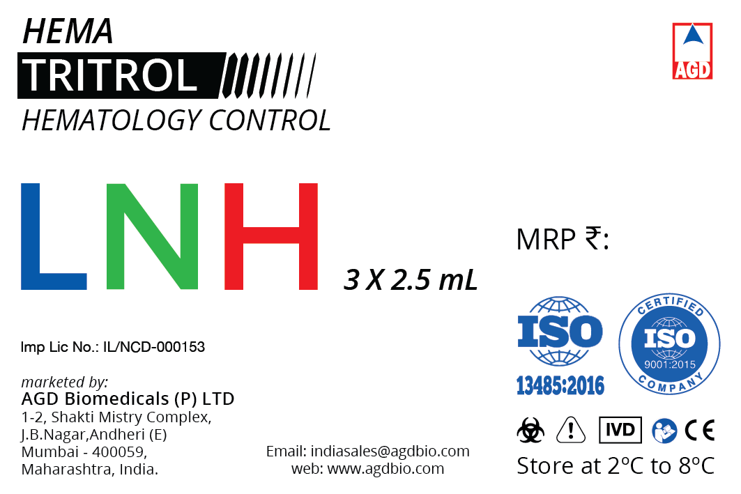
PROCESS - Keeping in mind the logo and it’s colours, and also the fact that this is medical packaging material that needs to be more utilitarian than anything else, I decided to keep it limited to typography.
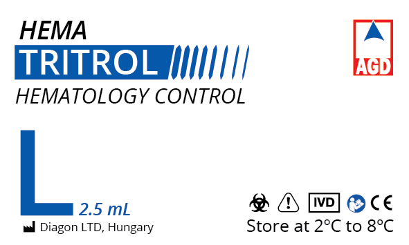
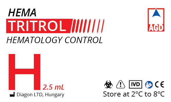
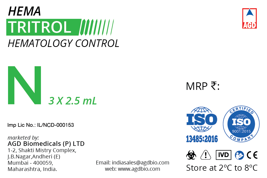
1 - TRITROL
This one has many versions, due to the different sizes and quantities.
The three colour variations and the fourth (which is a combination), are starkly different - only to make sure that they’re never mixed up with each other.
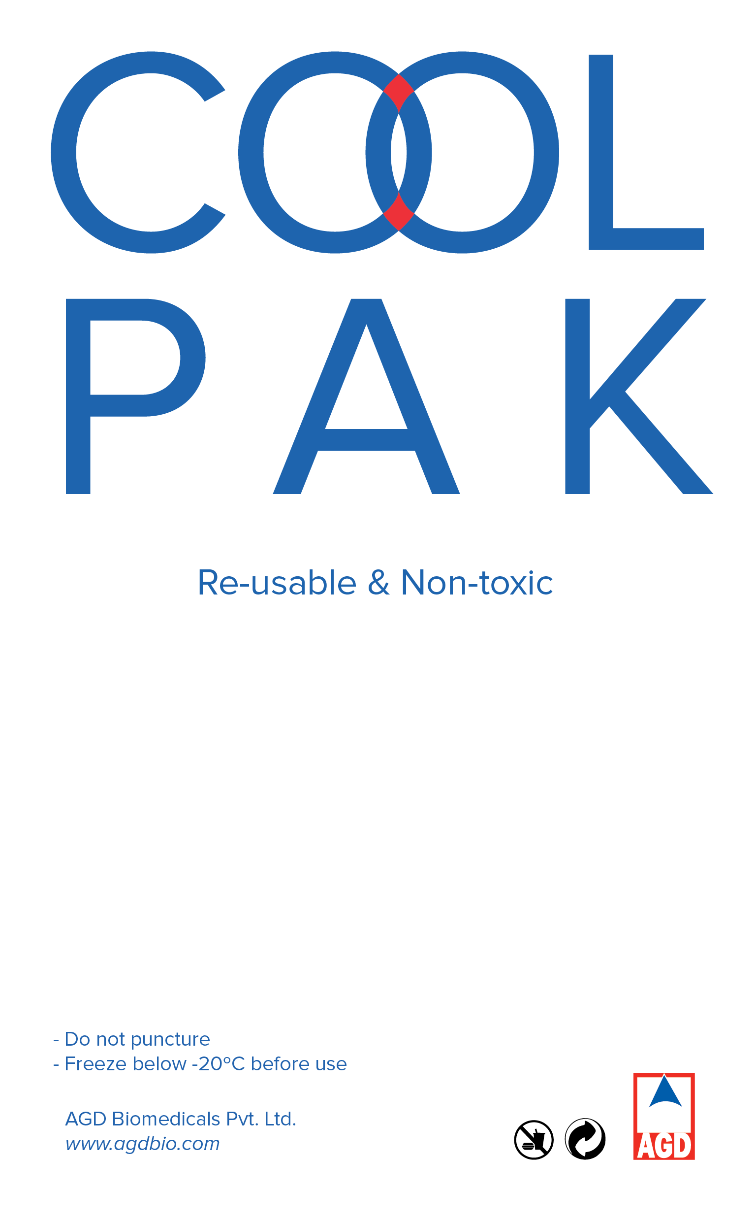
2 - COOLPAK
This is another very useful product that at the time was only being used by path labs, medical supplier storage units, and clinics. The client wanted to bring this into the retail market as well since it has a lot of uses even at home. It’s a gel pack, that once refrigerated - can hold it’s low temperature for longer durations than current alternatives in the market.