This is a logo design project for a music festival.
DESIGN BRIEF - As their name suggests, Future Theory is about creating festivals that feel time capsules. You feel like you’ve been transported through space and time, to be there, to experience what they’ve curated for you.
PROCESS - Since there is such a strong concept behind the name, I wanted their logo unit to also represent that.
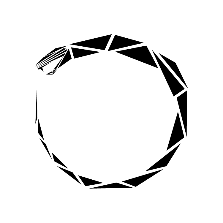
Diving into the time capsule bit - I realised that they relate (very strongly) to the cyclic nature of time. One of my favourite symbolisms of this very nature, is the ouroboros.
So using geometric motifs, I created their very own ouroboros for them. Here it is:
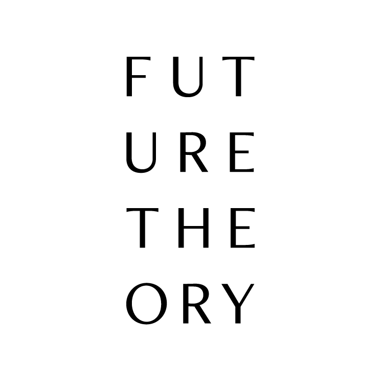
This led to the next half of the logo unit - the name. This is the final stack we went with:
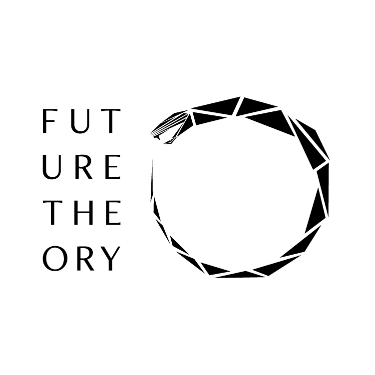
And here is the final logo unit:
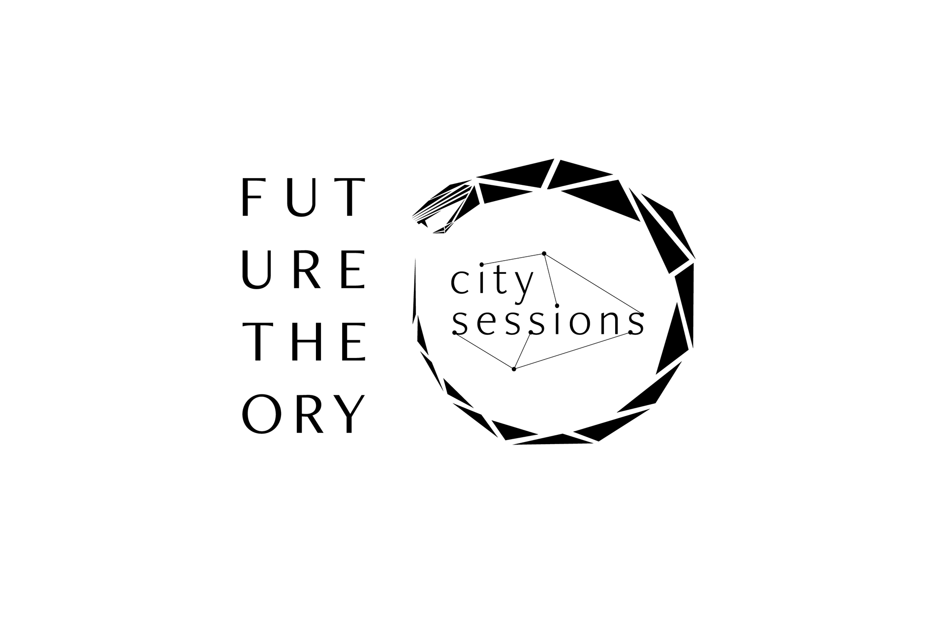
CITY SESSIONS
This has an added variation, since they also did a smaller version of a music festival in metro cities called the Future Theory:City Sessions.
Since there is a lot of connectivity involved, a lot of invisible lines being drawn everywhere, I decided to put that metaphor to use within the logo.
Here is the full logo unit for that: