This project was a brand design and an interior design project for a cafe.
PROJECT BRIEF - Minimalist but classic approach to the logo and the place, enough to have recall value, but also minimalist enough to feel like one could inhabit the space as they please.
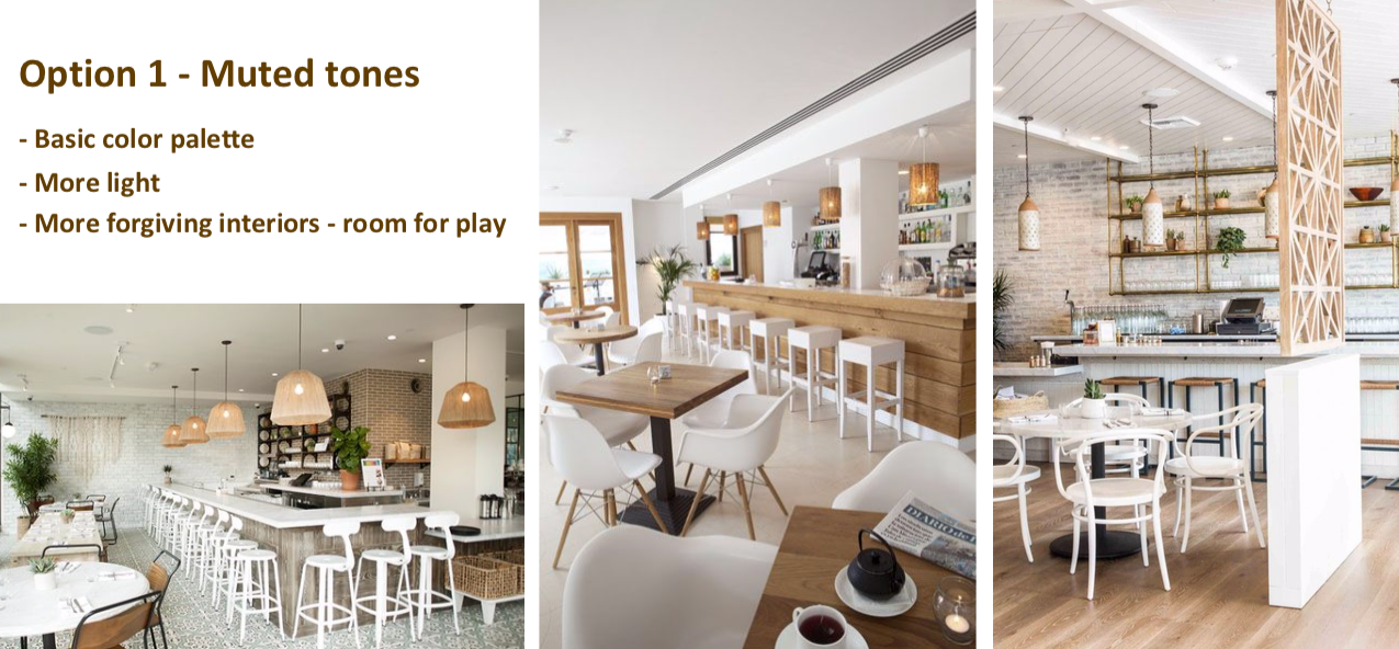
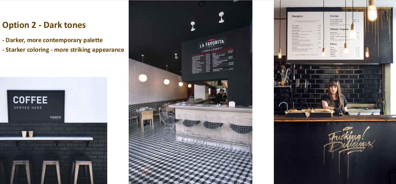
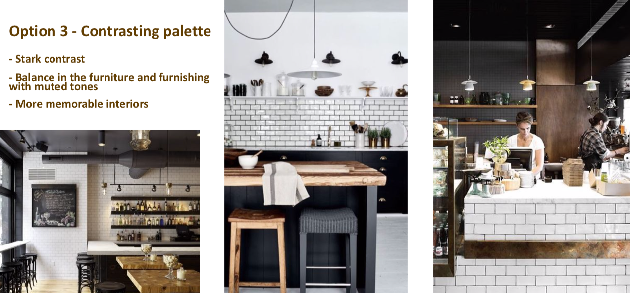
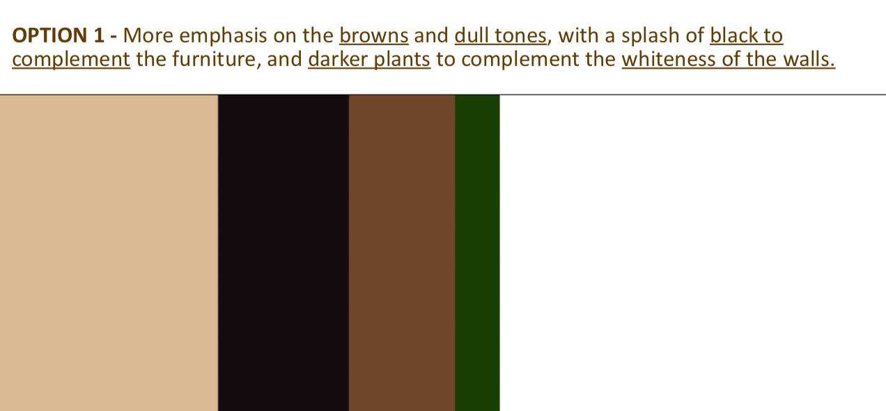
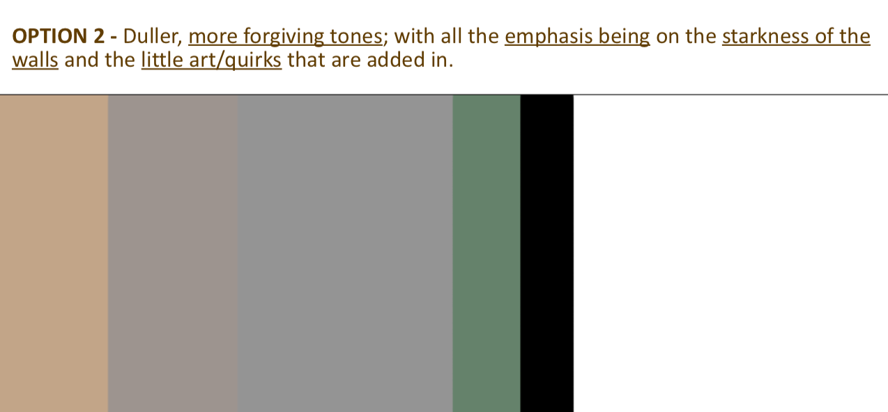
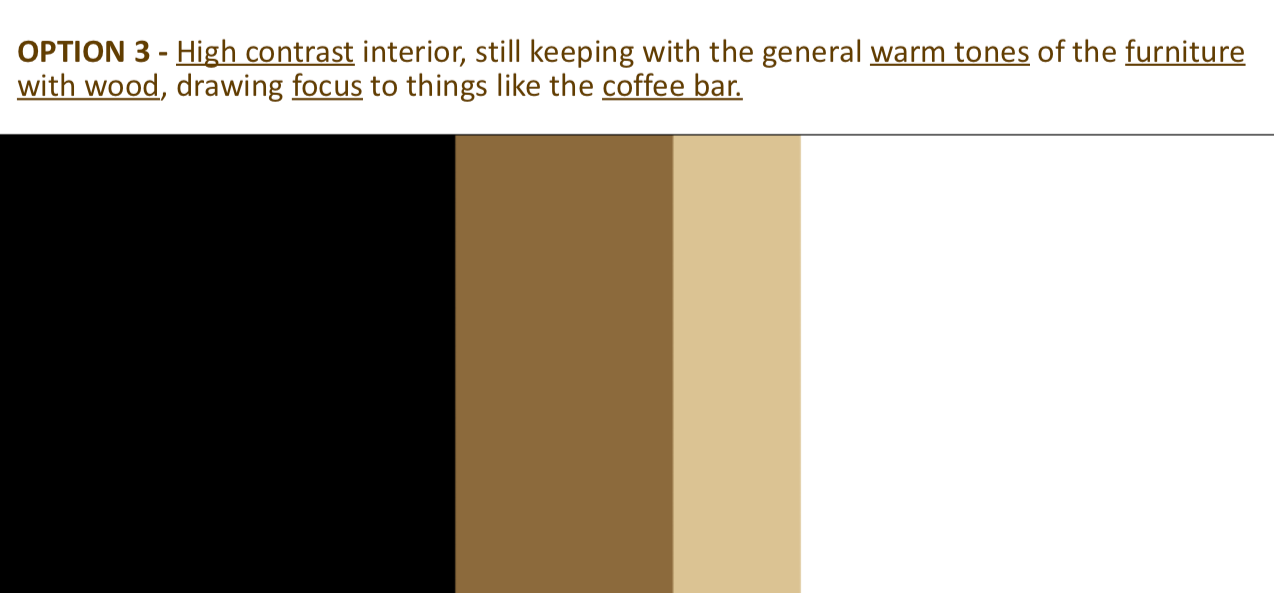
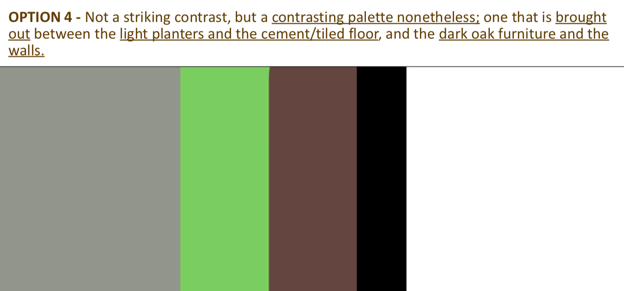
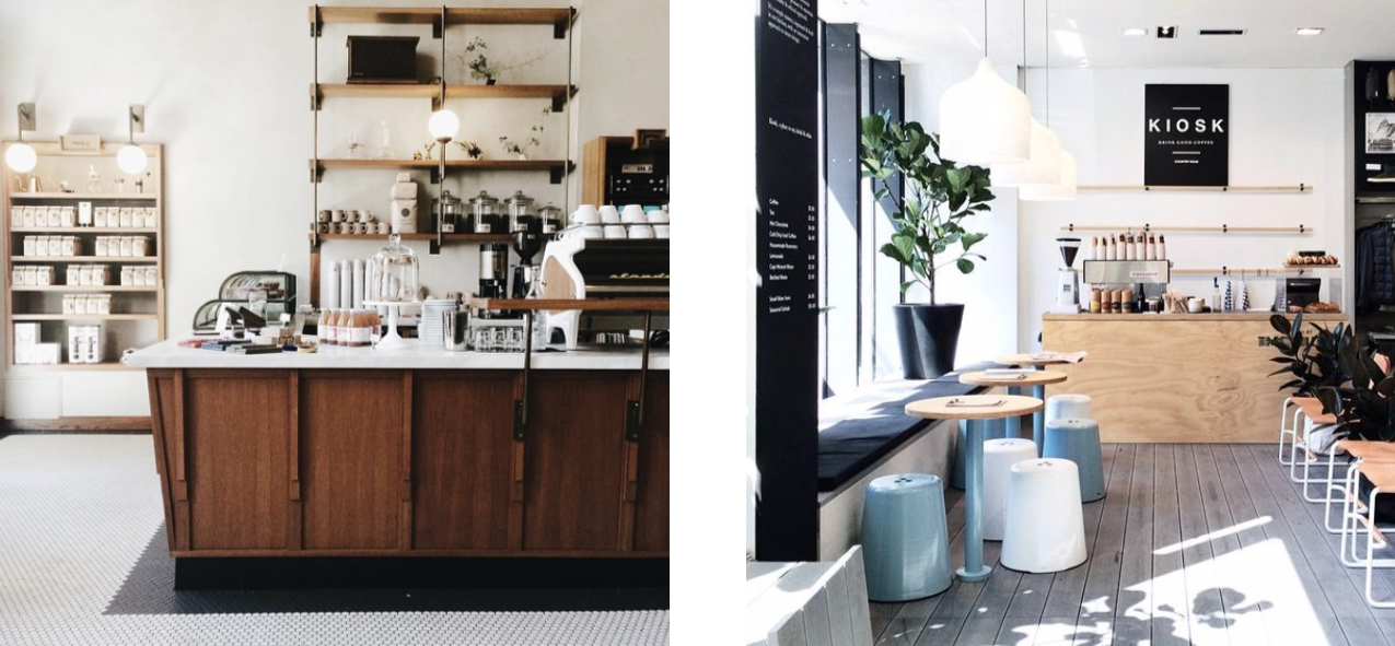
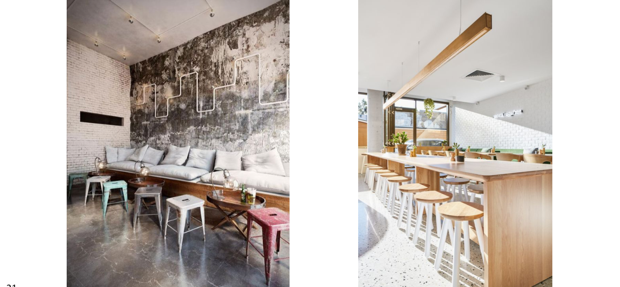
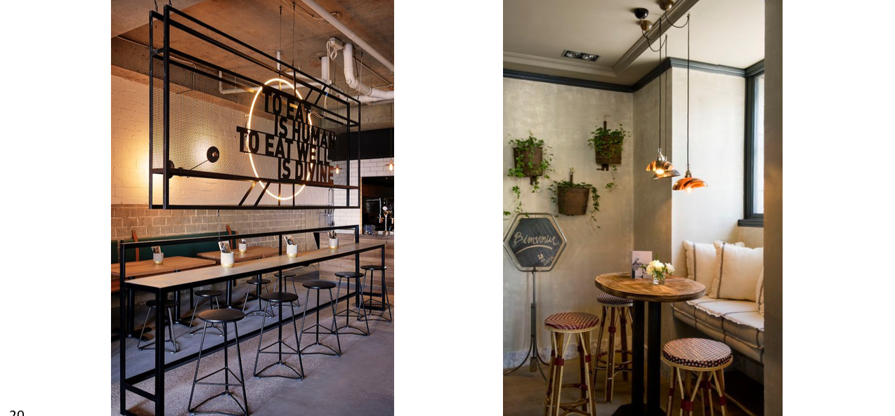
PROCESS - Against popular opinion, I chose to make a deck for the place first, including options for decor, references, and colour palette; and some extras - doing the interior bit before the brand itself. I chose this approach because I was designing for a cafe, and according to me, a place like a cafe is something that is inhabited by all sorts of people, and hence the place should inform the identity, and not the other way around.
Here are some spreads from the deck:
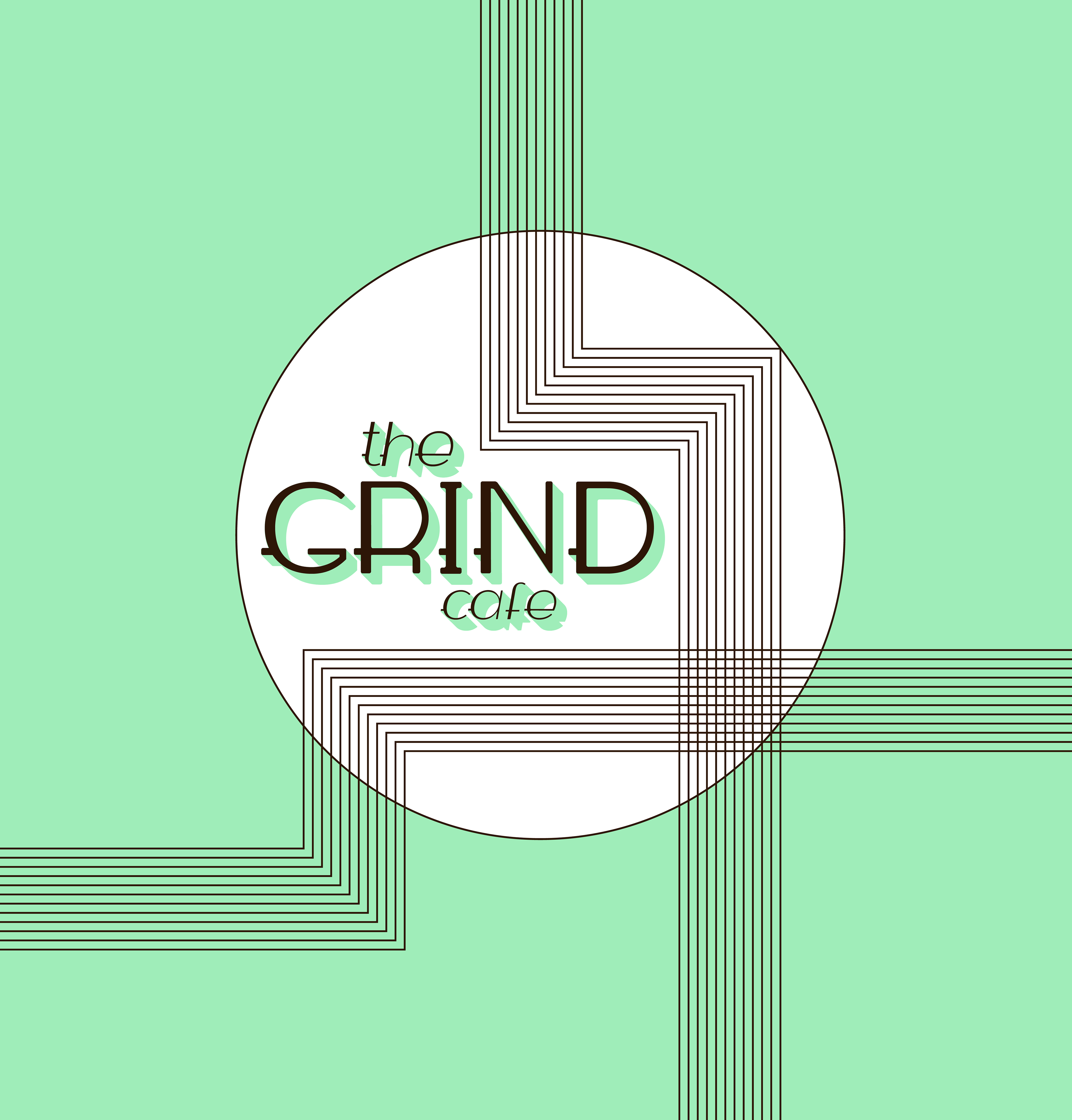
When it came to the logo, I decided to go the ‘Art Deco’ way. It’s something that is minimalist in it’s own way, yet geometric, and very very classic. It’s also something the clients resonated with, and the name too.
To start that off, true to form, I tackled the name first. Here is the final outcome:

Then came the ‘Art Deco’ bit of it, for which, I created this pattern that is sort of inspired by existing architecture in Mumbai, the city that this cafe is intended for.

The colour choice, of course, came from formulating the deck, and having a back and forth with the clients about it. This is what we all agreed resonated with the intention we had for the space and the brand.
Here is the final logo unit:
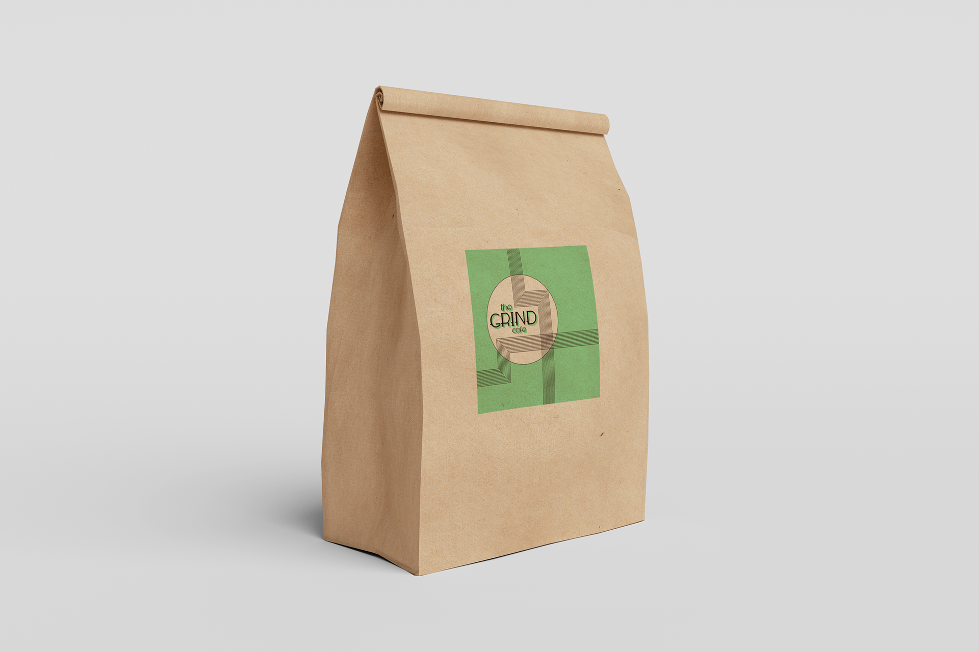
PACKAGING - Sticking to the minimalist and green approach the clients wanted, these are the final renders of the packaging design: