This is a logo design project for an LBT organisation that creates safe spaces for queer women to come out, party, and interact with other members of the community.
Since the name itself is a bit of wordplay - I decided to get playful with the logo too.
DESIGN BRIEF - To make a logo that resonates with the LBT community, without indulging any of the obvious cliches.
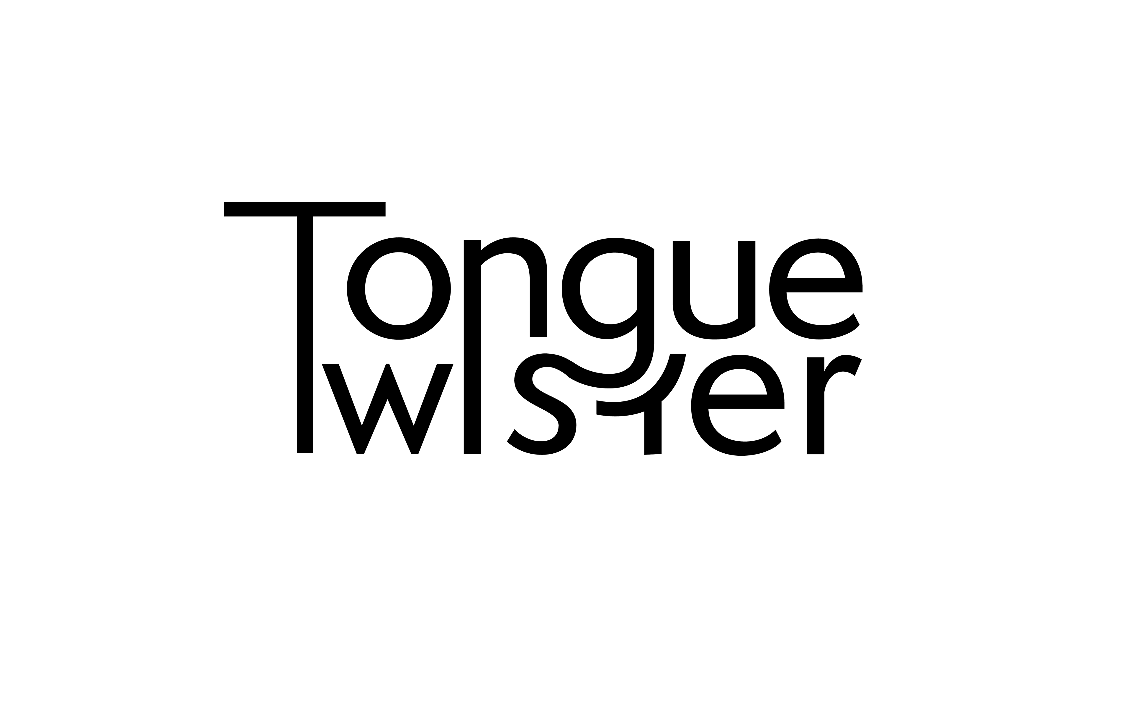
PROCESS - I took this on as a two part process. First, I decided to tackle the name. Using a bit of typography this is the final text unit that I designed:
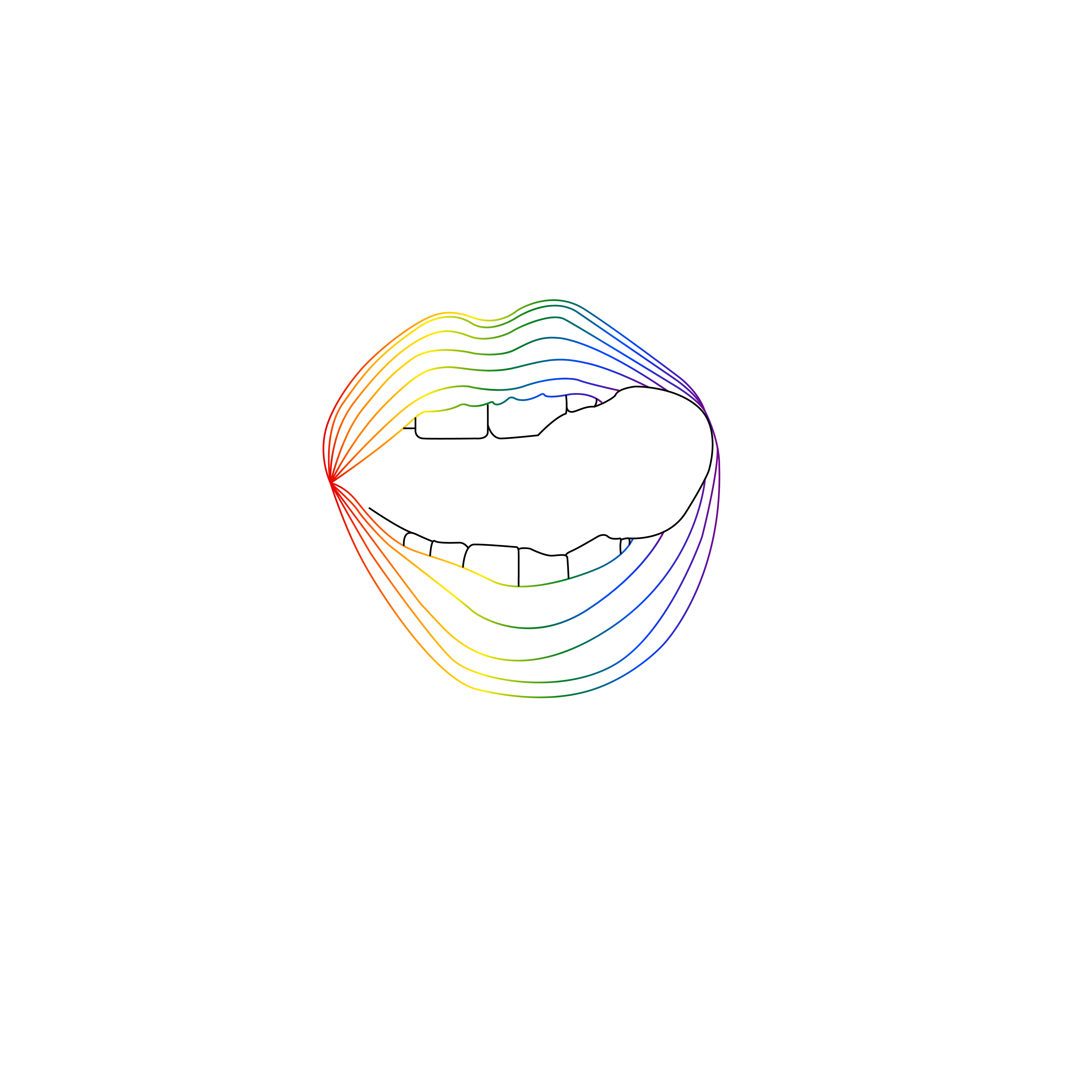
Second came the graphic aspect of the logo. I was already certain I wanted to use the colours from the Pride flag, but not blatantly. And keeping in mind my target audience, this is the graphic unit I designed:
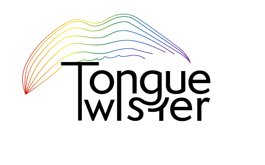
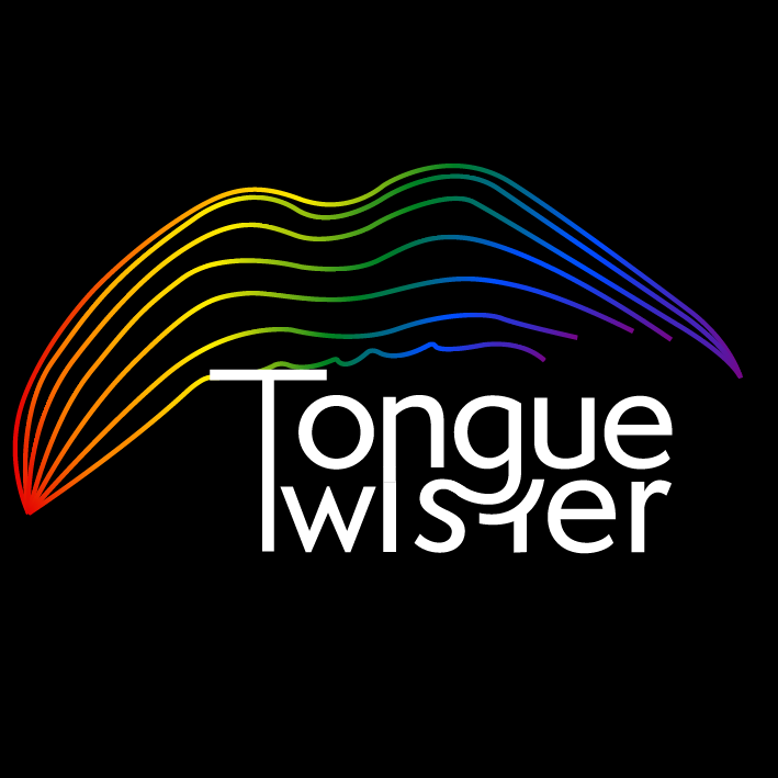
Finally, I put these two units together to form the final logo.